Chris Hadfield's Astronaut Insignia
The astronaut insignia for Chris Hadfield's second ISS mission needed to convey both personal elements about him and the International Space Station's mission. Its guitar-pick shape nods to Hadfield's passion for music. Inside, three stars represent his children; three interlocking crescents mark stepping stones to Mars. The white for Earth's atmosphere, grey for the Moon, and red for Mars itself. A solid blue Earth, encased by its atmosphere, symbolizes his commitment to water preservation and the environment.
CLIENT
TEAM
-
Art Director - Mathieu Robin
-
Agency - Kaboom
ROLE
-
Art Direction
-
Graphic Design

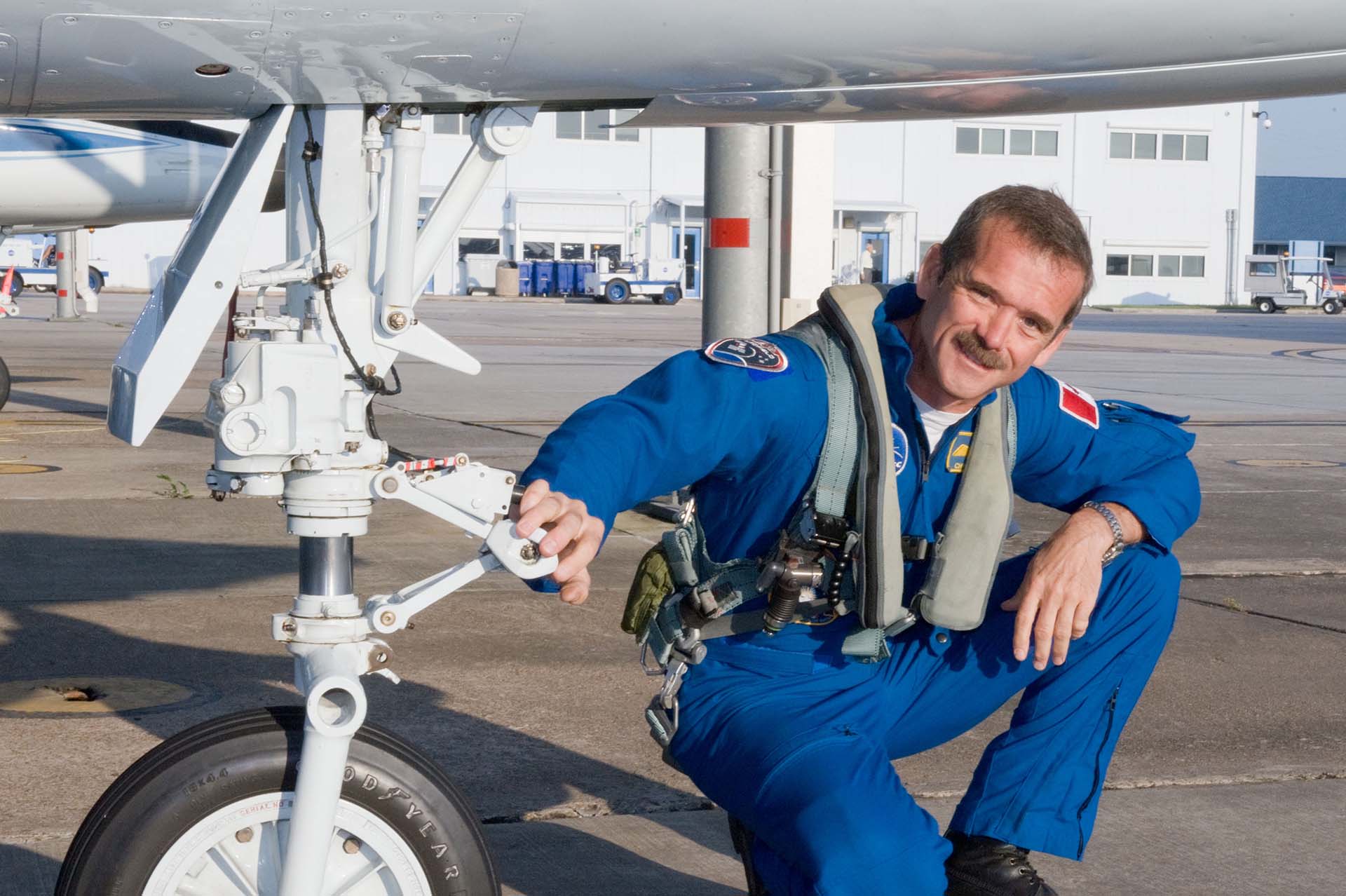
Expedition 34/35
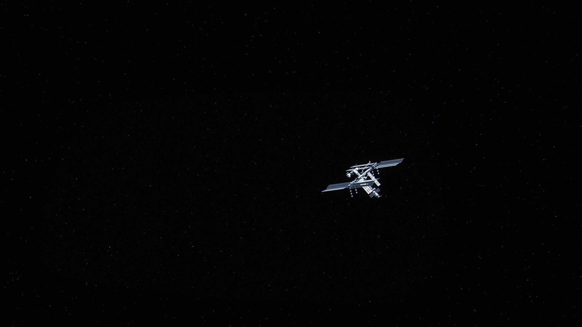
The International Space Station is the world's only space science and research facility in the weightless environment of space. Expedition 34/35 intends that the research done in this facility both benefits the environment on earth and our manned exploration of other planets and celestial bodies in the solar system.


“Operating a spaceship, you became intensely aware of how you are staying alive. How is power being generated? How is our waste being taken care of? . . . You live inside the machine that keeps you alive. And as you are orbiting the world you tend to notice that the same thing is happening on the planet next to you.”
Chris Hadfield
Commander of the ISS