Procase
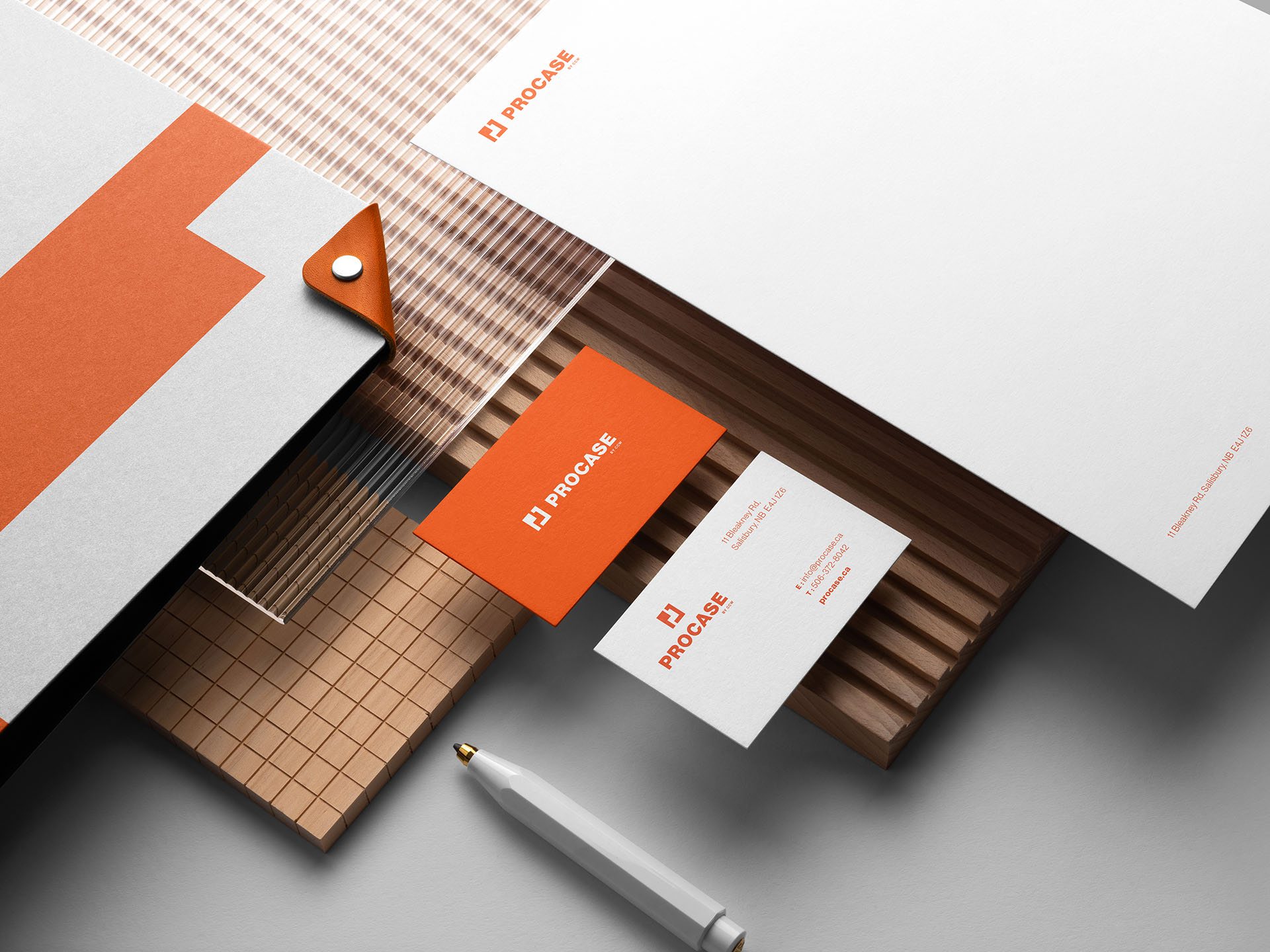
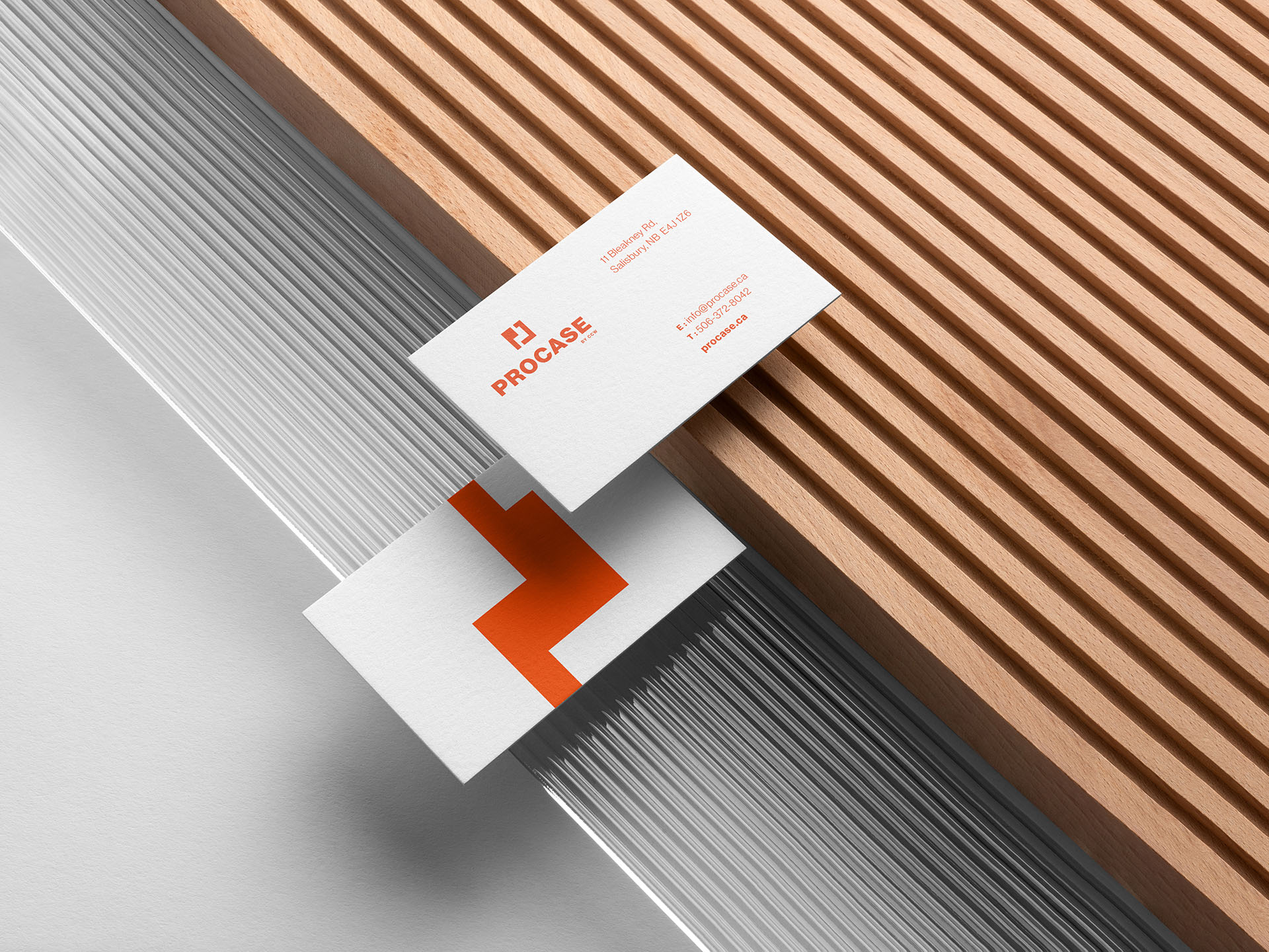
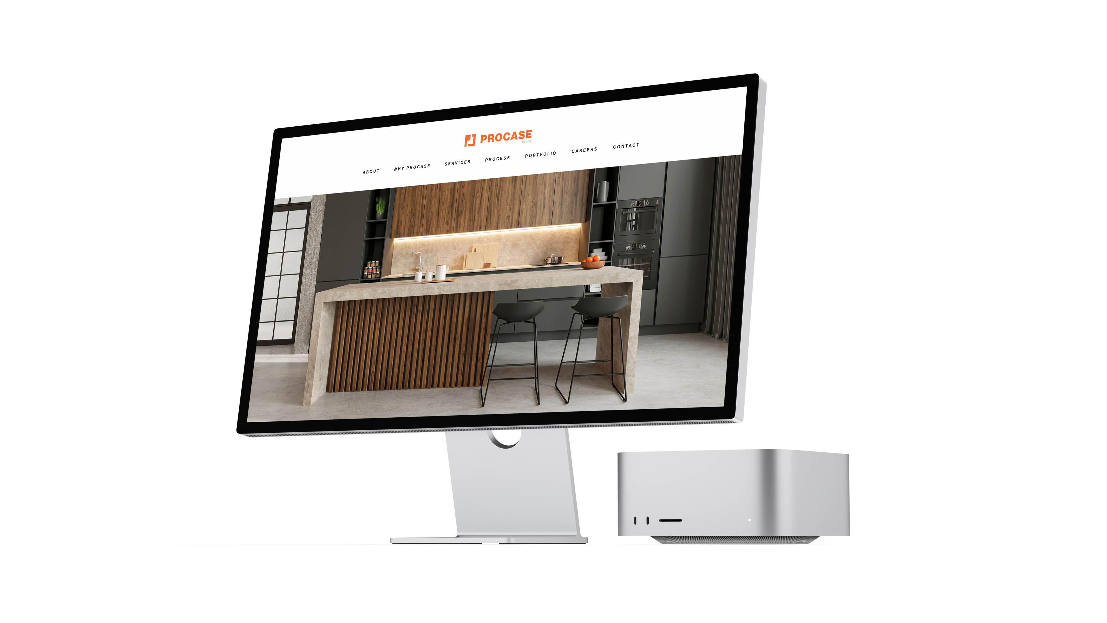
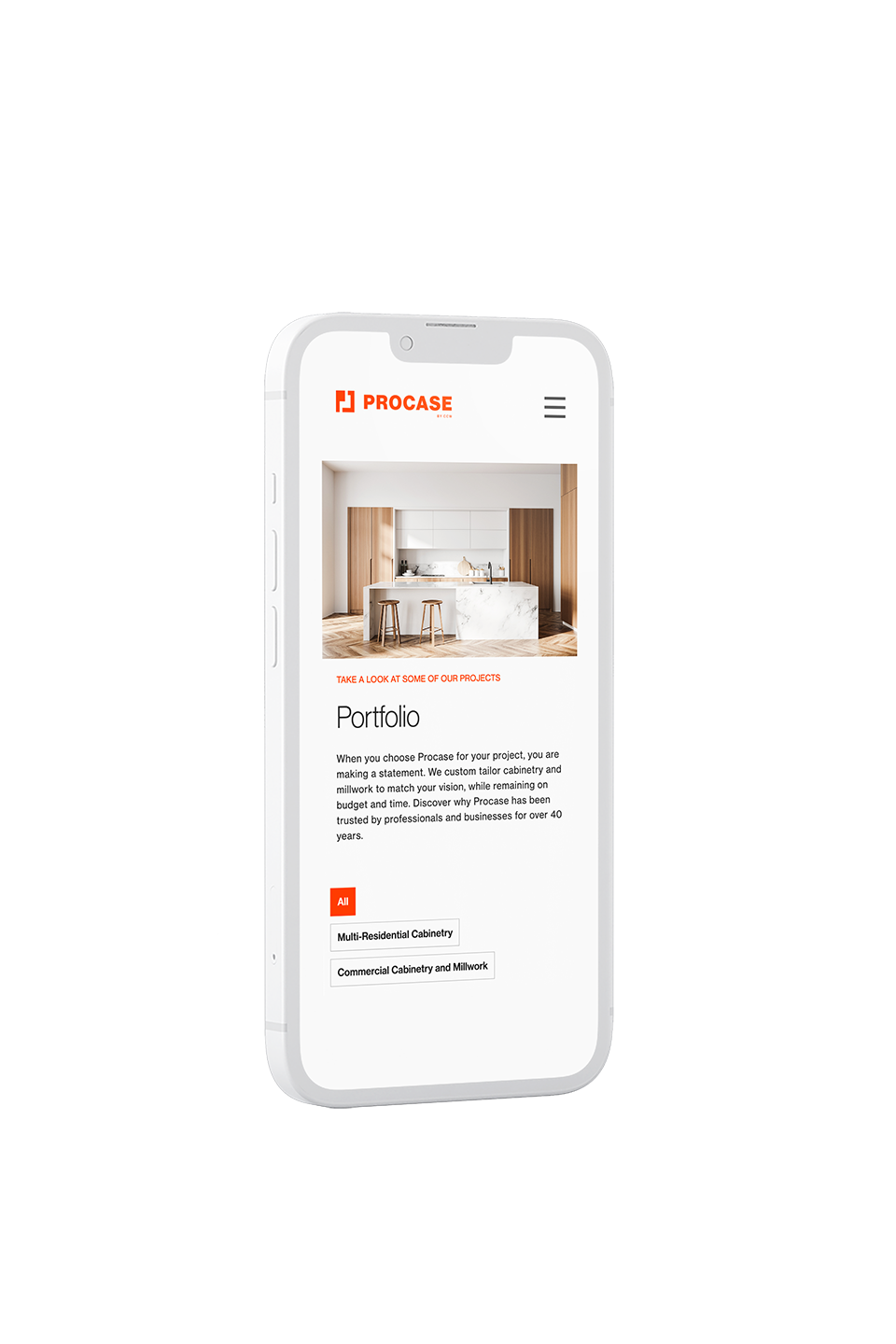
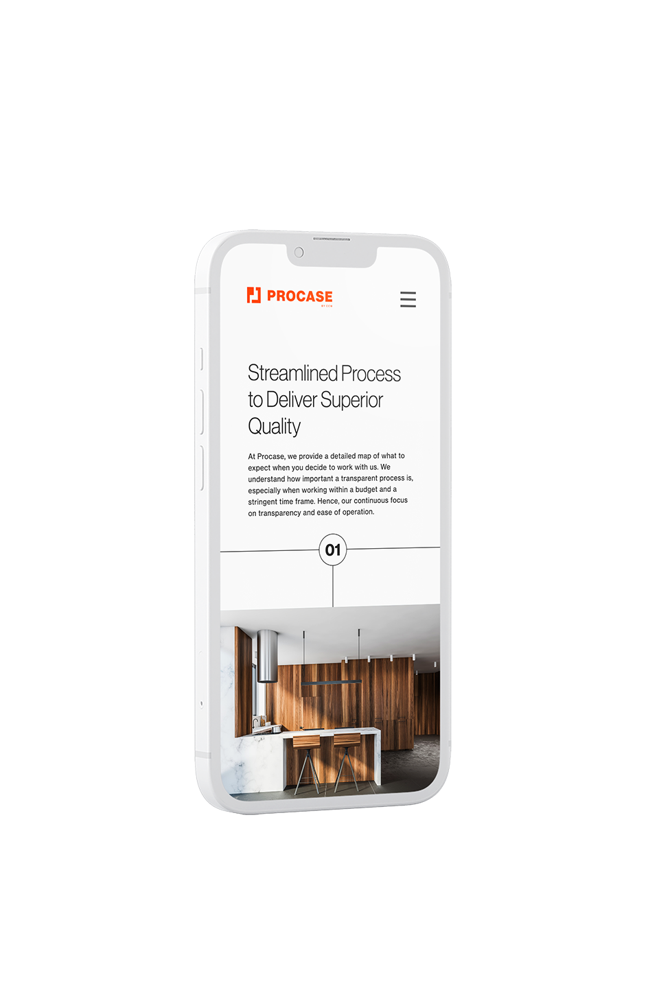
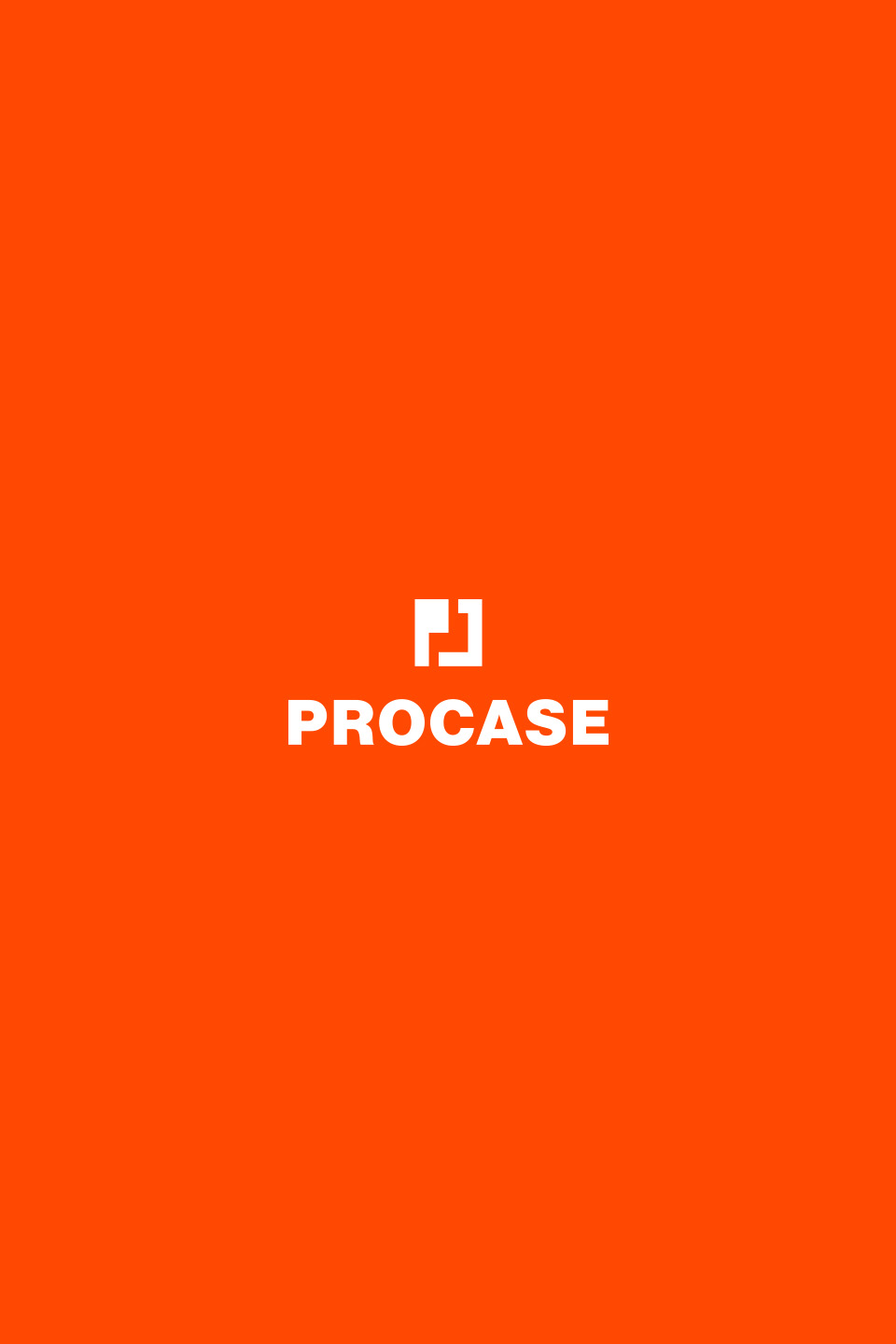
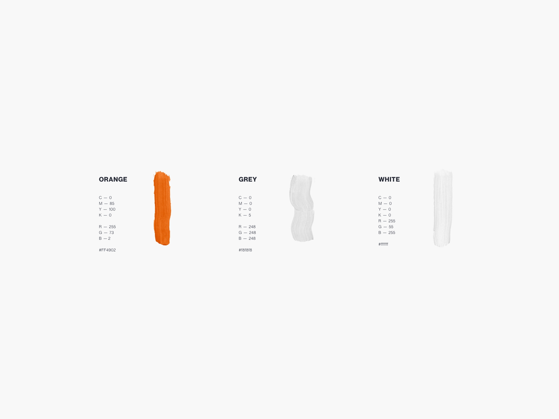
We constructed a logo built around Procase’s product: cabinets. The inset in square forms both the shape of a cabinet protruding from a wall, and the letter “P” for Procase. The right angles in the icon evoke blueprints, triangle squares, rulers and other tools used in the cabinetry trade that speak to precision and quality. A deep rich orange, monochromatic palette allows for a high contrast presentation of the brand, while conveying a notion of timelessness. The typeface selected for this brand is Neu Haas Grotesk, which is appropriately professional and legible.
CLIENT
TEAM
-
Art Director - Mathieu Robin
-
Agency - Posh Media
ROLE
-
Art Direction
-
Graphic Design